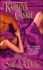
 HOW TO SEDUCE A DUKE - Caskie TODAY
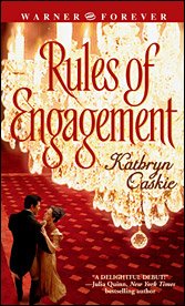
 RULES OF ENGAGEMENT - YESTERDAY'S CASKIE
Kristie recently mentioned something I have been scrambling to write about for days. She noticed how Margaret Moore's covers went from classy (when she was with Harlequin) to slutty (Avon) and then back to classy once she made a return to Harlequin. I have to say that I've got another author to add to the from CLASSY TO SLUTTY BOOK COVER CLUB: Kathryn Caskie. You'd have to be an utter moron not to see how dramatically the covers to Caskie's novels have changed ever since she decided to leave Warner Publishing and join forces with Avon. Check it out and judge for yourselves. I don't think the cover is terrible...I like having a sexy couple to envision while reading a good book (and hey, if I don't...I just picture Gerard Butler and myself), but the change is dramatic, to be sure (historical romance novel talk has rubbed off on me...I find myself giving office playboys nicknames such as Jeff the Saint or Alex "Lucifer" Jones).
Do slutty covers mean bad books? Only asking because Quinn and Kleypas covers (recent ones) are tasteful and you know all you need to know about the quality of their books. Hmmm....no clue...perhaps it's a right of passage. New authors get the stereotypical bodice ripper covers and the veterans (who've paid their dues) get the tasteful, more sophisticated ones with trees and flowers on them. Food for thought....
Minor Disclaimer: Cannot stress this enough....I have no problem with covers such as Caskie's...it's just the dramatic change in them that got my attention. I'm just trying to figure out how Avon's COVER ART Dept gets its ideas...cause it's obviously not from reading the book, as many fans well know (hasn't anyone read a book with a blonde heroine and then looked at the cover and realized the lady on it was a brunette?).
12 comments:
I thought that the Avon cover department actually only had a couple of ideas, and they just get recycled over and over with a different coloured dress/background
As soon as I saw the covers, I KNEW the first one was an Avon cover. I linked and sure enough. My next thought was "oh crap" (because I only cuss on rare occasions when I get real upset :) )
There is a decided difference in the two covers!! The second (earlier) one is very classy - and the second (Avon) aint!!!!
OK - thinking about this has gotten my upset - damn! Why did she have to move?
You look at the earlier covers you posted from Warner and while they are sexier then the first (second) Caskie - they are still much more - I don't know - refined(?) looking than the Avon cover. The Avon cover looks cheap and tawdry next to them. And (I'm getting more worked up here) shit! Even look at the difference in titles!!! How To Seduce a Duke (cheap slutty title) as opposed to The Raven Prince or Ways to Be Wicked.
Damn!!! Hell!!!! Shit!!! Asshole cover artists and bastard title givers at f$*%in Avon.
well I was just wondering, is this due to Avon? I mean, does this happen to other publishing house and do Lisa Kleyplas and Quinn are with Avon also?
Other publishers have equally bad covers but not with the consistency of Avon. And many of them have gotten better over the years. I can't comment on Julia Quinn' covers since I haven't even picked one up for quite a while, but even with Lisa Kleypas' Devil in Winter, while it's nice on the outside, the inside step cover is terrifingly dreadful (half naked man in cape, barefooted woman - in winter!!!). Don't know about the inside of her newest - but I will later today :) I will remain convinced until they change something, that someone somewhere at Avon' art department has a secret disdain for their readers. That's the only explanation I can imagine for their continually ridiculous covers. As Romancelover has shown here with her previous posts, you can have very sexy covers that have style. Avon's don't!
"now stepping down from my soap box" :-)
But kristie it is purple ;)
heee, sorry I suck but hey the one caskie I read I didn't like so it is all good *g*
LOVE the title ways to be wicked and to be fair isn't that a bed cover too?
Ways to Be Wicked does have its lead characters in bed together but somehow the cover comes out a lot more classy than the purple Caskie one. I'm not hating the Caskie cover, but seriously...what the heck happened to the simplicity of her earlier ones? I read a Caskie book once before and didn't care much for it. I have other books by her but haven't read them yet. I'm just wondering how they decide what covers to give whom. Lorraine Heath's cover have progressively gotten...err...I don't know if MORE SLUTTY is the word I should be using but the one for her book out later this year is just horrendous, something with the heroine grabbing the hero from the back. I wouldn't mind it normally, but the heroine is so unattractive, I just can't stomach it. Is the art dept short-staffed?
talking about slutty covers... this one drew my attention this morning while I was at the bookstore
http://images.chapters.indigo.ca/covers/books/941/0060779411_b.jpg
On the side, you get to see her with the hero...
Seriously, I've been quite happy that some of these covers have moved to the inside cover, because reading these in public ^^; Seriously, not that we're seeking the other genres' approval, but these kind of covers, it doesn't help the common opinion of romance.
NATH - I can't get to that site you mention.
Re: covers...I know a lot aren't ashamed to walk around with the raunchy ones but...well, honestly I don't feel comfortable bringing one of them to work. I admit to co-workers I read romance novels but really actually bringing one opens up a can of worms I'd like to remain closed (they all think I'm too picking and what not)...
I couldn't get the link to work either but I did earlier and it's the Jacquie D'Allesandro - Never a Lady. And it's red. Very, very red.
Sybil: There's purple, a very soothing pretty kind of colour. And then there is PURPLE THAT HURTS YOUR EYES PURPLE. LOL - the book is the second colour purple.
Kristie...oh...saw that one. Actually want to get the book because I like D'Alessandro but the cover? Gosh, it's hideous! I actually prefer the older bodice ripper covers with Fabio to that one (and that's saying a lot). I don't get that one at all...it's not attractive at all. Again I must ask: ARE THEY SHORT STAFFED IN THE ART DEPT?
all right, i was going to post the link again, but I guess by now, everyone has the title :P but just in case:
Never a Lady by Jacquie D'Allesandro
The blurb sounded good tho. If you get it, tell me how good it is... Never been a fan of regency, but been so bored lately... I got 2 books by Julie Anne Long this week-end...
Post a Comment